As mentioned in the Release Note, GetCurve is an excellent tool to extract information from an existing chart. It will convert the point coordinates from the chart and even perform curve fitting to obtain a best polynomial to describe the curve passing through all the input points.
Here we will further show you some examples on how to perform such task with GetCurve.
Firstly, here is an article on United States congressional apportionment on Wikipedia. There is a chart which represents “Population per U.S. Representative allocated to each of the 50 states and DC, ranked by population” in the Reapportionment Section.
This a typical bar chart and we will take it as an example to show you how GetCurve can help you acquire the numbers inside.

Whenever you see a chart on any document, on the projection screen or on your laptop, you can take a picture by your iPhone/iPad/iPod devices. When you start GetCurve, you will see four buttons to the lower portion of it. As prompted by GetCurve, please start the App by selecting “Pick Fig.”. You can either select the photo you just took from the camera roll or select any photo from the photo library.


After that, the selected chart will be shown on the center of the screen and the “Align Axes” button will be flicking. Now we can move forward by tapping the “Align Axes” button.

As explained by the description and the illustration, now we need two points on the X axis and another two points on the Y axis to construct the coordinate system.

After “Proceed” button pressed, the App will prompt the message that it is waiting for the input of four points with the order specified.

After the completion of input of four points, GetCurve needs to know the real high and low values of the X and Y axes. This is a necessary step for the conversion between the screen coordinates and real coordinates. If either or both X and Y axes are of log scale, please simply tap the Log Scale buttons to “YES”. GetCurve will automatic convert the X and Y coordinates by logarithmic calculation.

Here is a screenshot of the complete of all high and low values of this specific chart.

After that, we can move on by tapping “Acquire Pts” button. Another description and the associated illustration will be shown on the screen, this step is simply the input of any number of points which portray a specific curve on the chart.

Here we start from the very first point on the X axis. Immediately after we input a new point, we will see the real (X, Y) coordinates shown on the screen. For example, the Population Per Representative will be ‘728375’ when the Population Rank of State or District is ‘3’.

As we continue to input more points, GetCurve will start the polynomial curve fitting at the same time and the resulting fitting curve will be shown as well.

As the nature of polynomial curve fitting, the complexity of input points will eventually cause the polynomial fitting to fail. Under such case, we strongly recommend to divide the overall X span to several sections so that each section can be represented by a single fitting curve. For our example here, the first section stops at X=31. Therefore, we obtain a fitting curve which portrays the Population Rank from 1 to 31.
When you press “Done” button, the “Output” button will be flicking to note you that the calculations are all complete.

As you press “Output” button, you will first see a list of all X and Y coordinate values of the points from the Acquire Pts Page.

As you press the top right button with up and down triangles, the second page will be shown which includes several text fields for user input. As you input a new value in any one of the text fields as the real X value, the corresponding Y value will immediately be shown to the right of the text field.

There is no limit on the X value and of course the Y value is based on the calculation of the resulting polynomial and the value may be unreasonable when the input is out of range.
As you press the top right button again, the third page with the function of output text file and email generation will be shown. Three file types are available to fulfill you with such need.
1. Tab-separated values
2. Comma-separated values
3. Space-delimited text

An option is also provided that the resulting curve-fitting formula and coefficients can be included in such text file as well.
Whenever you press the icon on the top left of the screen, this will reduce the Alpha value of the current output page. You can double check all the Acquire Pts and the resulting fitting curve.

An example of the email to be sent is shown below.

As you press the top right button again, the fourth page with the coefficients of Curve Fitting is shown. This is for your reference and all the values can be included in the text file as the email attachment as the “Incl Curve Fitting Coeffs.” Button is checked.


So far we’ve went through all major functions provided by GetCurve, Should you prefer to personalize the operation of GetCurve, we also provide a “Settings” button which let you change certain setting of GetCurve. The parameters include Fitting Line Width, Circle Mark Radius, System Text Color. Just to name a few of them.


A second chart of ‘United States Population per Representative’ in the Section of ‘Controversy and history’ serves as our second example. Please kindly follow the same steps described above.


The screenshot below shows the low and high valves of X and Y axes in the ‘Align Axes’ page.

When in ‘Acquire Pts’ page, we use eight points to describe this chart. As shown below, the resulting curve portrays the bar chart quite well.


More screenshots of the output pages are as below. We can easily acquire the corresponding population on the year of 1950, 1960, 1970, 1980 and etc.

Example #2:
Here we have another example with a more complex curve in an article discussing the ‘2007–2012 global financial crisis’.
In the section of ‘Background’, we found a chart of ‘GDP Share of U.S. Financial Industry’. Let’s see how GetCurve can help you acquire the point information from this chart.
A screenshot of our inputs in the ‘Align Axes’ page is shown as below.


Starting from the year of 1860, we specified ten points in the ‘Acquire Pts’ page to portray the curve until the year of 1873.

This is the list of all X and Y values.

We can now easily acquire the corresponding GDP share on the year of 1870, 1880, 1890, 1900 and etc.


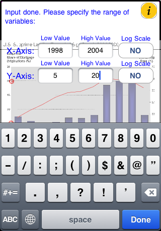
Next let’s perform similar analysis on the chart of ‘U.S. Subprime Lending Expanded Significantly 2004-2006’ in the section of ‘Subprime Lending’.

A screenshot of our inputs in the ‘Align Axes’ page is shown as below.
Starting from the year of 1997, we specified ten points in the ‘Acquire Pts’ page to portray the curve until the year of 2003.

This screenshot shows the coefficients of the polynomial curve fitting.

We can now easily acquire the corresponding Subprime Share on the year of 1997, 1998, 1999, 2000, 2001 and etc.

By applying similar procedures, we obtain the results on the chart of ‘U.S. Household Debt vs. Disposable Income (DI) and GDP’ as below.


No problem to perform curve fitting on the chart of ‘U.S. Current Account or Trade Deficit: Dollars and % GDP’.


In short, whether it's a column chart, bar chart, line chart or XY scatter chart, GetCurve can always help you extract the numbers back. With GetCurve, you will never be afraid of the cumbersome logarithmic conversions because of the log scale on the X or Y or both axes. GetCurve will take care of all the complex calculations for you.